Interview by Jim Jansen of NFV's Spinner magazine.
You spot a new pinball machine across the room. It's unfamiliar, but even before you examine the playfield features, you've already formed an impression about the game.
It is the artwork on the cabinet, the backglass, the playfield and the plastics that creates the aura which sets the tone and mood for a game long before that first coin drops into the slot. It is an integral part of any game and increasingly recognised as worthy of appreciation and exhibition.
One of the most enduring of pinball artists, Greg Freres has worked on games as diverse in theme as Rolling Stones, Vector, Star Trek - The Next Generation and Medieval Madness. Starting at Bally in 1978 and continuing with the company as it became Bally Midway, and then under Williams ownership, he now works at Midway games, just three blocks from the original Bally pinball factory.
At Midway he has worked on the Touchmaster countertop games before moving on to console games where he is now teamed up with former pinball designer Brian Eddy, working on a game called Stranglehold in conjunction with movie director John Woo. But Greg's career began in the advertising industry after gaining a fine art degree. He spent two years there before jumping at the opportunity to work on pinball games after which he never looked back.
Greg Freres
Greg spoke to Jim Jansen about his time in the pinball business, the challenges and excitement of each different project, the people he has worked with and way vague ideas are transformed into the beautiful artwork we all get to enjoy.
How important is the artwork to the success of a pinball machine?
Coming from the Point-of-Purchase advertising business, I knew right away that the art package was not only an important sales tool, but most importantly, the lure that would attract the player to the machine and hopefully drop the first coin. Of course, the game play itself is the primary focus of a pinball playfield but all of the other elements…the rules, the light shows, the mechanics, the sounds, and art all work together to create the best games. Everyone has a different opinion of what makes a great game but the shear variety of themes is another facet of pinball that has kept it alive for so long.
Can you describe the artwork design process?
For me, lots and lots of rough sketches, a garbage can big enough to accept all of those rough sketches, more rough sketches, and then… a few more. Sometimes the beginning of the project is the most exciting and the most nerve wracking at the same time because there can be so many possibilities. Having a solid theme established before the drawing begins is key to this early success.
In the big picture, I would begin with ideas for a backglass and the title of the game. Once I got the backglass idea to a point where it provided a springboard of direction for the rest of the game, I would begin working on cabinet art. I would get the cabinet art roughed out and by that time the playfield would be at a point where the artist could begin to provide input for insert layout. From this point on the focus would be on the playfield and all of the related parts associated with it; plastics, ramp decals, target decals, and playfield toys or other gizmos. Having all of the related playfield art done allowed the printers enough time to get parts in house so that the production line could begin building the prototype games.
Then it was time to go back and provide the finished art for both the cabinet and backglass. Our department was set up so that the main artist of each project could get pieces designed and handed off to a group of “production” artists that would help do the finished separations for the silk-screened parts. This was an efficient way to get a lot of art through the system because there was always more than one game in the design/production cycle. Margaret Hudson is a talented artist that provided not only full illustrations for backglasses and playfields, but also played a major role in production art. Her attention to detail is amazing and has color separated many (a majority) of the playfields produced since 1977. Kevin O’Connor, after leaving the business for a free-lance career, also became instrumental in this support role, while also maintaining his prolific workload as a full time pinball artist. All of us were capable of creating the production art and some got their start in the business in this supporting role. Pat McMahon started as a student intern; Linda Deal worked mostly as a support artist for the first 6 months before becoming a project artist. And when we got really busy around 1990, I was able to hire Paul Barker as a full-time Production Art Coordinator. Both he and Linda were instrumental in getting us through the passage between hand-cut separations on rubylith to digital separations on computer. And I landed the job at Bally because of my knowledge of production art and darkroom skills. When I first started at Bally, my days were split between shooting all of the films from the other artist’s separations, and then going back to my drawing board and working on whatever pinball project I was assigned.
Is it true that in the '80s the games were designed first and the artwork would follow later?
That is true of all of the games up until the early to mid-eighties. A marketable theme would be selected after the game layout was tested and tweaked. The design department would then select the next likely playfield candidate and make art and sales aware of the whitewood.
For instance, when I worked on Harlem Globetrotters, I was told by the art director, Paul Faris, that marketing had just landed a deal with the team’s management. In a couple weeks we had reference material from them to work with and I began working out ideas for the backglass. I worked with Greg Kmiec on that project and I remember bantering some ideas around for the playfield with him but not like the design process by the 90’s. In some ways this was a much easier process but I really enjoyed how we later grew into more of a design team philosophy.
Later the theme was picked first, which probably resulted in a lot of communication between the pinball designers and the artwork artists. Correct?
Absolutely. The creative process definitely became more of a team effort and I believe contributed to the escalated success of pinball in the 90’s. The first game that took on a more team-like structure for me was Vector. It was an experiment that the company sort of forced on us because we needed to compete with video games. It was bit awkward at first, many people feeling that this was too much of a “design by committee” approach, but as time went on we definitely grew into the idea.
Which way do you prefer?
Obviously I like the collaborative approach to design because the ideas are allowed to grow and flourish. Of course everyone on the team is still responsible for what they believe will be the best for the project in their area of expertise, with the game designer having the ultimate say, but there’s nothing like working with a small group of creative people in designing the next best game. There was also a competitive atmosphere that came out of the team approach that I believe became the fuel for better games with the “total package” approach.
Did you as an artwork artist have anything to say about the theme?
Yes. Not every game but as I grew into my position and became more familiar with the product, I became more hands-on with theme selection. Also, as part of my incoming portfolio I had done a piece that Paul Faris asked me to complete in a week, a piece that represented what I thought would be a good fit for a pinball game. I created an illustration called Summertime that helped land the job. After a couple weeks of working, Paul came to me and said the next game was going to be based on aspects of my illustration and renamed…“Skateball”.
What is your favourite part of the process?
That’s a tough question. I enjoyed brainstorming early on and just writing down any and all ideas and then filtering through all of those ideas to begin building the rest of the project. I also enjoyed the day that the first playfield was delivered to the factory for art approval, before the prototype run was started. The playfield would be wrapped in craft paper with my name on it and I’d unwrap it and the smell of the fresh hard coat would escape and I’d look to see if the printer matched the colors that I chose. The process of silk-screened graphics when I first started didn’t have a color proofing system, so the first time you’d see all the colors come together (other than your hand drawn color-sketch) was this first playfield. This day was both exciting and anxiety ridden because it would be everyone’s first impression. Norm Clark would always look at the artist and (half-joking) say, “How come it’s not Red, White, and Blue?” Later, we got the proofing system down to a science and were able to see a facsimile of the playfield before they would begin printing.
As an artist, could you predict what games would be popular?
Sometimes you would hope that the buyers and players would be as excited as you by the idea of a game but it didn’t always work that way. Plus there is a big difference between “popular” and “sales numbers”. When we really thought we had something, the sales wouldn’t always be there. Elvira won Best New Equipment at the 1989 tradeshow, but only sold around 4000 units compared to Police Force on the Williams line that sold closer to 7000 units. Part of this discrepancy was customer perception of the Bally product. The buyers were still reluctant to buy the Bally product because they thought the quality wasn’t going to be as good as the Williams games, based on previous history. It took a long time to convince the customers that the quality control was now coming from the same building with the same people in control. It was usually easy to know which games would be popular with players based on how popular they were during in-house testing.
Is there a reason why the artwork on the backglass usually (or at least at Bally and Williams) is a lot more detailed than on the playfield?
After we started doing 4-color printing for backglass and translites, the ability to render a full color spectrum with smooth, airbrushed gradations made it easy to create a more detailed illustration than with the line-art style we used for silk-screened playfields. At first, people felt that there was a visual disconnection created by the painted backglass vs. the line-art playfield. I can’t disagree with this theory but as an artist I felt I was able to provide a much more elaborate piece that would act as the first point of contact with the “customer”. Plus, album covers in the 70’s really took control of what people considered pop-art, and became an art form unto themselves. Pinball backglasses now had the ability to look more like album covers and less like comic books. Don’t get me wrong, much of my work is just as inspired by earlier pinball art (line art) and comic books, but I’m glad to have entered into the business when we had the ability to expand the palette.
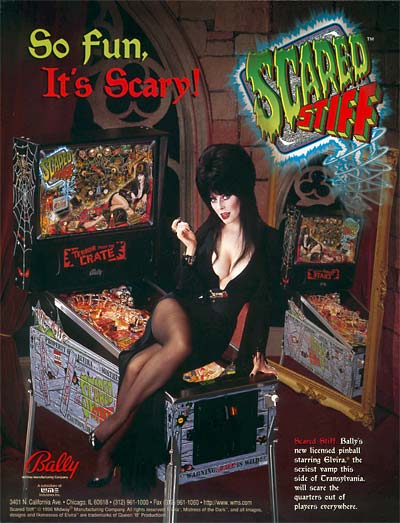
What do you prefer, realistic themes based on celebrities (Star Trek, Rolling Stones), fictive figures (Dr Dude, Captain B. Zarre) or the combination (Scared Stiff)?
I think I had more fun creating the unique characters and their related theme for games like Dr. Dude but there is also satisfaction in creating work that is already a world-wide icon like Star Trek. The “home grown” themes were always a bit more challenging because you have to create every aspect of the world it lives in. The Elvira projects were the best of both worlds – a recognized icon but with a lot of freedom to create the theme around the character.
Often the final artwork is different than early production sketches. For Scared Stiff we have seen a completely different backglass. Does that happen often? Are there some early designs you regret they have not been used?
Most of the early sketches are just that – early sketches leading to a more finished and more polished version of your original ideas. In the case of Scared Stiff, our direction changed drastically when management asked us to come up with something that included a more interactive backbox feature. I liked the first sketch but the final art fit the new direction. In fact, the name Scared Stiff came after we added the spider feature to the backbox.
On Vector the whole Addams Family cast is shown on a plastic. Where there already plans to use that theme in a pinball machine?
Um…really? Huh, I kind of forgot about that. Now that you mention it I do remember putting that on a video monitor in a background scene. I have no idea why I chose that image and it’s probably something that I shouldn’t have done but there were fewer lawyers in the world back then. Ok, I’ll take credit for the foreshadowing of the best selling pinball game of all time.
With Hardbody you were one of the first to use photos on the translite. Was that an experiment?
Ugh. Why did you bring this up? This was a “me too” approach to pinball design. Actually, Gottlieb had started the whole photographic approach to backglass design and some folks at our company thought that to remain competitive, we would need to follow their lead. I didn’t agree with the approach but followed through. Hardbody was not one of my favorite projects (except for the photo shoot in LA).
In 1984 you worked on a game called ‘Mysterian’, Do you have pictures available of that machine? Why did it not go into production?
As the name implies, Mysterian remains one of the biggest mysteries in Bally pinball. I have very little recollection of working on that game but I did do some rough sketches for the backglass. I don’t think I have those sketches anymore but if I ever find them I’ll let you know. I think someone or something erased that project from my memory.
In the 70s and 80s women pictured in the artwork of pinball machines always seemed to have big breasts. In the 90’s women in the artwork seem less sexier than before (Obviously Scared Stiff is not one of those games). How come?
Ummmm. Hmmmm. Well, maybe the era of “political correctness” took control and we had to scale back? I have received plenty of negative feedback throughout the years for various projects. I remember someone getting in my face at a tradeshow criticizing me for allowing someone in my department to create the outrageous and totally inappropriate artwork on Truck Stop. For some reason, when Williams and Bally merged in ’88, the folks in management thought that the “Bally look” included breast sizes of enormous proportion. So, in response, the first “Bally” game from the Williams merge was…Truck Stop. Maybe that had something to do with the animated critique I got at that trade show.
Later, I received a letter from a male nurse disgusted by the depiction of the nurse he saw on Dr. Dude. And I also received a letter from a college student telling me that she was embarrassed to have a game like Elvira placed in her dormitory because of my overstated depiction of the female anatomy.
We did more licensing in the 90’s so the graphics needed to fit into the “style guide” of each license. Ironically, Elvira was one of the first licenses Roger Sharpe proposed to the design department after the Williams Bally merge; a license that, in certain respects, seemed to match upper management’s view of the “Bally look” at that time. Another footnote, the Elvira license was the first in a string of licensed properties throughout the 90’s; obviously some more successful than others. I was glad to be a part of this initial licensing effort.
Who decides what the toys on the playfield (trolls, coffin, and so on) will look like?
Depending on the toy, it’s usually up to the artist to draw sketches that the sculptor can work from. Once the sketches were complete, the mechanical designer would work with the footprint and design the needed mechanism in conjunction with the sculptors work. The mechanical designer would design the limitations that the sculptor would need to adhere to. The sculptor would then send in sample parts that the artist could paint as a guide for the production company molding the parts. We were very fortunate to work with three talented sculptors from the toy industry – Jerry Pinsler, Dave Link, and John Balo.
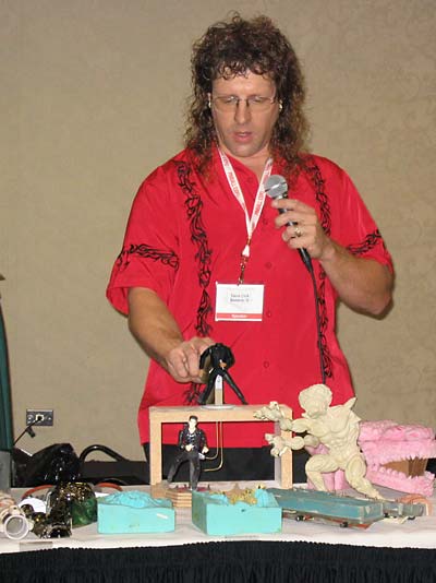
Dave Link with some of his sculptures
The Williams designers often put ‘easter eggs’ in their games. Artwork artists are also known for adding ‘hidden artwork’? Can you give us some examples of things you put in games?
On the Harlem Globetrotters backglass, on the globe they are standing on, look at the Chicago area – a blob of WHITE paint. That was the winter that we had 89 inches of total snowfall for the season – we haven’t had that much snow since. My kid’s names are somewhere in the art for some game but can’t remember which game now.
These hidden references in artwork, who’s idea are they?
Anyone on the team that wanted to hide something. Some artists were more notorious for adding hidden gems to the artwork. Pat McMahon always added fellow employees to his work, caricature style. When I worked with Steve Ritchie he had an old backglass hanging in his office from an earlier game. During long meetings I’d get up and look at the different backglasses in his office and one time I found all of this hidden art that Steve had no idea existed before I pointed it out. Kudos to Seamus for hiding stuff even the designer didn’t know about. (Check out Hyperball’s backglass).
You left the pinball industry after Revenge from Mars. Do you miss it? Working on a game and so on. If yes, what do you miss most?
Yes I miss working in pinball a great deal. It was always like a family atmosphere both at Bally and Williams – just different families. I made lifelong friends and met my wife, Andrea, in the pinball business. I miss working with a small group of people – the team I work with now is larger than the entire pinball engineering department at Williams. And I also miss doing artwork. My skills are now mostly management related since I never made the jump to 3D graphics.
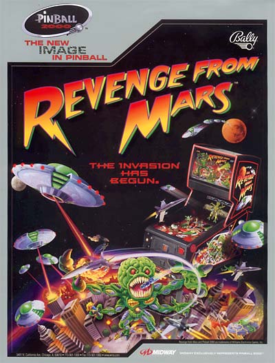
What do you remember from the time you worked on RfM, the last Bally pinball machine?
The trip to London and seeing the reaction to the Pin 2000 concept at the ATI show. I also remember seeing George and Pat’s prototype “Holo-Pin” mock-up for the first time and how I thought that this could truly be the next generation of pinball. The whole experience included some of the highest highs and lowest lows of my career in pinball – condensed into about 18 months.
Earlier this year there was an exhibition of pinball artwork which included your work too. What was it like to have your work exhibited?
It was great! There hasn’t been an organized exhibit of Pinball Art since the early eighties when Conny Mitchell and Ed Paschke put together a very comprehensive show in Chicago.
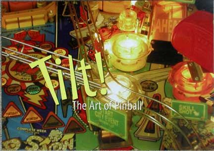
The Cedarhurst Museum in downstate Illinois hosted the recent show, titled “Tilt: The Art of Pinball”, from May through July and the curator, Kevin Sharp, did an excellent job of showing not only the original art but many of the finished, playable games in the same exhibit space. Cedarhurst was a former family estate that left about 90 acres of land and a huge amount of American fine art to the nearby community. It was a real thrill to see my work hanging right around the corner from a Mary Cassat and Thomas Eakins! Kevin Sharp called this show one of the most unique events at Cedarhurst and was thrilled with the interest it brought to the Museum.
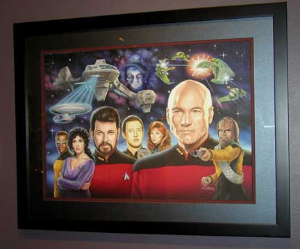
Original artwork for Star Trek - The Next Generation
What artwork from you was on display?
Harlem Globetrotters, Star Trek: The Next Generation, and Revenge from Mars backglass paintings and various playfield and backglass sketches for Medieval Madness. I had also saved a couple hand written lists of ideas for the name of the game and meeting notes that I took while brainstorming all of the sight gags that John Youssi added to the backglass art. They included these lists in the show, appearing inside a clear cube on a pedestal. I found this humorous but Kevin wanted to show as much of the process leading up to a finished product as possible.
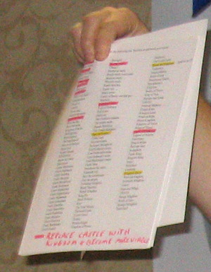
Greg's list of possible names for Medieval Madness
Is there a chance the exhibition will come to Europe?
I spent a lot of time speaking with Mr. Sharp about the logistics of traveling exhibits. It would take a full-time effort on someone’s behalf to organize a show like this. One of the best things about this exhibit was the combination of the original art hanging next to the finished machine. All of the machines were donated for use by the museum from a group of Pinball collectors from the area. It would definitely take an amazing effort to pull this off in a variety of communities around the world, but the internet does make this a bit easier to think about. Perhaps someday, but for now I would say “Tilt: The Art of Pinball” was a one time event.
Did you choose the work shown at the exhibition yourself?
Yes, Mr. Sharp asked me to choose pieces that spanned my career as a pinball artist.
If so, why did you choose the items you selected from all of your work?
I chose HG because it was my first, RFM because it was my last, and ST:TNG because it was technically my best (IMO). I would have liked to include some of the Elvira work but since this was only the second time I participated in and lent work to an exhibit of this kind, I didn’t want too many pieces away from home.
Or did you contribute in another way?
Mr. Sharp also wanted to show the public the “process” of creating the Art of Pinball from start to finish. Between the work of John Youssi and myself, we were able to show the very beginning thumbnail drawings all the way to the finished backglass illustration for Medieval Madness. I think this idea was done very successfully and people at the opening reception seemed fascinated and amazed by the amount of effort it takes to create a complete pinball art package.
From all the games you did the artwork for, do you have a favorite one and why?
I’m more of a campy horror fan (SS) than a sci-fi Star Trek fan but I suppose both of those games rank up at the top. They are as close to a complete package that I discussed earlier – sounds, lights, music, voice, kinetics, layout, ball control, unique features – everything adding up to a really entertaining experience true to the license attached.
And what is your favorite pinball machine that you did not design (and why)?
I’d probably have to go back and choose the games I played before I got in the business, before I knew what I know now. During college I played a lot of Wizard – Dave C’s artwork was amazing. Evel Knieval was one of my favorite games to play after graduating from college – the spinners hooked me and the animated backglass of Evel jumping was unique. Once I got in the business I loved playing Silverball Mania – to me the graphics that Kevin did for that game were the epitome of Pinball Art. Then into the 90’s the game I played the most that I didn’t work on was T2 – a really great presentation.
You worked twice with Elvira. Any special memories from working with her on those games?
One of the best people in Hollywood! She was so fun to work with and allowed us to create the best possible game without getting in the way of the creative process (like other licenses tend to do). Cassandra is one of a kind and I think her love of pinball is what fueled the team to do some of our best work. She was genuinely excited to have a pinball game (or two) with her name and likeness on it and even gave a “shout out” to an old pinball playing friend on the backglass – “Yo, Travis!” She thought that was so cool. Later on Scared Stiff she wanted to include her baby daughter in the graphics and her nickname is “Lil’ Luna”. She also was great at supporting the marketing effort for the games by attending the trade shows where we debuted the games by signing autographs for fans waiting in line for hours. I’m so happy to be part of both of those projects.
On the backglass of ‘Elvira and the party monsters’ some green arms are holding the BBQ. Is that the creature from the black lagoon?
More or less – another foreshadowing of a future Bally game? I must have been slightly clairvoyant.
In the Stiff o Meter of Scared Stiff, on level 3 another face was used on the prototype compared to the production game. Why?
Another instance of Cassandra wanting to include the whole family. After she saw the playfield she asked us if it wouldn’t be too late to include a shot of her husband somewhere in the game. We suggested one of the faces on the Meter and they sent a photo of Mark (aka Smarky – see EATPM) reacting appropriately to that level of “stiffness” – Blood Curdling, I believe.
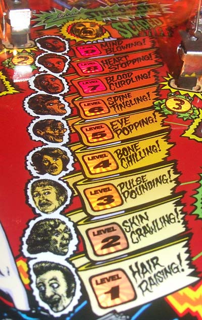
Who are all those people in the stiff-o-meter?
All my teachers from elementary school.
As you already did artwork for several pinball games that included monsters: Why didn’t you do the artwork for Monster Bash, too?
Maybe because George Gomez didn’t like me at the time…just kidding. I was probably already on another project. I would have enjoyed working on Bash, no doubt. I grew up collecting everything monsters. I still have my Aurora (brand) Frankenstein model proudly displayed in my basement that I glued together and painted in 5th grade.
Your colleague John Yousi works a lot with Pat Lawlor. Do you have a favorite designer?
That’s a loaded question. I had unique experiences with every designer I’ve worked with – how’s that for political correctness? I think I had the opportunity to work with almost every game designer at both Bally and Williams. In the 90’s I probably spent most of my time working with Dennis Nordman and Steve Ritchie. Both designers have completely different design methodologies and both are capable of creating an awesome yet totally different pinball experience…an experience that’s way better when I’m involved. :-)
Greg with Dennis Nordman
Speaking of John Youssi: on Medieval Madness you and him worked together. How did that work? Did you focus on a certain part and John on other parts? Or how should we see this?
I acted as the art director for the project and gave John sketches for the backglass and cabinet to work from. He then took what I gave him and as George Gomez and I used to say…”Youssified it.” Both of those pieces are incredible and I’m still in awe of John’s mighty ability to add the detail that makes the art sing. We also did the same for the cabinet of Revenge from Mars. John set the bar pretty high on that cabinet and it was difficult for me to live up to his standards on the backglass. John is great to work with and I hope we can work together again someday.
I also did the playfield graphics on Medieval Madness and helped oversee the design and production of the sculpted Castle and Dragon. I also sat in on the writing sessions for the voice package, getting to work with actors and writers from Chicago’s Second City improv theater. A little known fact: One of the female voice talents in the game went on to become a Saturday Night Live cast member…Tina Fey! And you can hear my vocal chords doing my best voice-over work as the Jousting announcer.
Medieval Madness became one of the most popular pinball machines, especially for collectors. Did you have any idea that game would become so popular when you were working on it?
I had no idea it would become such a prize for collectors. I was leery about a medieval theme from the beginning but knew if we could use humor it would help sell the idea to management. When Brian presented the idea to me, I liked the simplicity of the theme (attack the castle). I’m glad Brian asked me to be part of the design group.
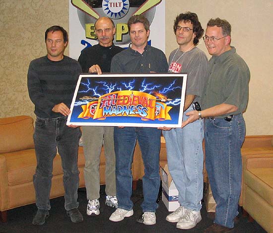
Medieval Madness design team
(Dan Forden, John Youssi, Brian Eddy, Lyman Sheats & Greg)
What did you like the most in making artwork for pinball?
Probably the creative freedom that the business gave us as individual artists. There were other venues for illustrators to work in – book covers, comics, magazines, but nothing could compare to the fun we had making art for pinball games. I’m so lucky to have been part of such a pop-culture icon. The best - having people go on vacation to far away places (Paris, Tasmania, Amsterdam) and send me a postcard telling me they saw my name on a pinball game in a tavern, café, or arcade. The second best – meeting new people and being able to tell them…”I’m a pinball artist.”
How is your relation with other artists? Do you have contact with them?
Since I’m no longer in the business of pinball I don’t see everyone as much. We had a good group at Bally and Williams that became good friends over the years. I’ve always said that Pinball was the best and only fraternity that I would want to be a member. Once a year at Pinball Expo it’s like a family reunion. And up until a few years ago I was playing drums in a Rockabilly band lead by Kevin O’Connor. Two pinball artists in one band! Now that’s got to be a once in a lifetime opportunity. Would you like to buy a CD?
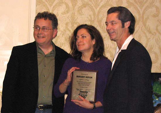
Greg, Margaret Hudson & Kevin O'Connor
Are you still following the pinball scene? If you could do one more pinball machine, which theme would you pick and why?
I hardly ever get a chance to play pinball but I try to keep up with who’s designing what game for Stern. I’ve been over there a couple times to play the first test games. I can’t tell you what game I would want to do because maybe someday I’ll have that chance.
Is there a chance we will ever see you back as a pinball artwork artist, for Stern or an other company?
Never say never, as long as my drawing hoof still works and I have good ideas to contribute.
 Back to the learn page Back to the learn page
Back to the front page
© Pinball News 2007
|